MuCoinDesign study · 5 min read
Making the first budget less of a form.
A personal-finance onboarding concept that turns income, expenses, and savings goals into a reviewable starting picture.
Read the case study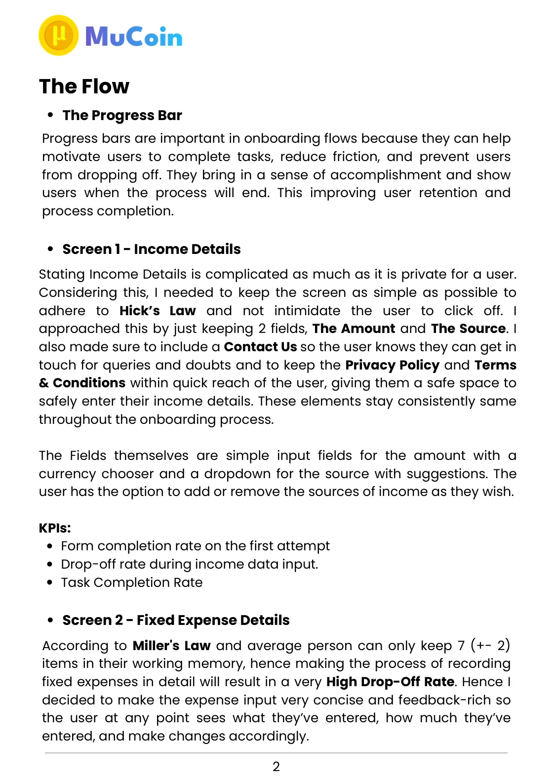
The source is a written design rationale. Its performance claims are reframed here as hypotheses.
View full size ↗01 The problem
How can the setup give something back before it is finished?
A useful financial picture depends on personal information that takes effort to recall and can feel uncomfortable to share. I structured MuCoin around a sequence that asks for income, fixed expenses, variable expenses, savings goals, and a final review. The design challenge was to make that effort understandable and correctable.
Designed for Person setting up a budget. Enter information accurately and understand what it adds up to.
User context Design assumption
Preparing a first picture of income, spending, and savings.
- The friction
- Recall takes effort; mistakes are easy to make before the full picture is visible.
- Design implication
- Give input an immediate summary and an editable review.
Example situation · illustrative scenario. Picture someone setting up a finance app. They are recalling income, estimating expenses, and deciding how much personal information to share—all before seeing whether the product is useful.
02 The outcome
A financial picture that can be corrected.
I designed a five-stage setup flow for income, expenses, savings goals and review. The entry patterns repeat, the summaries give something back along the way, and the final review stays editable. The accompanying KPI figures describe targets for a future test, not measured completion or drop-off.
More about the experience
- Five connected stages. Income, fixed expenses, variable expenses, goals, and review.
- A measurement plan. The original percentages are targets for evaluation, not achieved results.
03 Research & direction
A picture worth reviewing
The flow already contained a useful idea: show the emerging financial picture while a person enters it. Each summary can become a chance to understand and correct the information.
Original flow rationale · five stages
- 5
- onboarding stages
- 3
- review groups
- Prototype
- linked in source
My direction. I structured the onboarding as a repeatable sequence with visible progress, immediate summaries, and an editable checkpoint.
More about the original process
The original write-up explains the flow screen by screen, including privacy links, expense summaries, editable goals, and review behaviour. It also defines proposed KPIs for each stage. The design centres on repeatable entry, useful summaries and a review that remains editable.
The source mentions a small user subset when discussing the label Saving Goals, but gives no sample size, protocol, or measured comparison. I treat that as informal input. The numerical completion and drop-off figures in the appendix are targets, not results.
- Enter
Ask for a small, repeatable unit of information.
- See
Return a summary while the context is fresh.
- Review
Make the complete picture editable before submission.
04 Design decisions
Make each onboarding step useful.
Open a decision to see the reasoning and trade-off.
01Ask for a small, repeatable unit of information
The income stage starts with amount and source, while fixed and variable expenses use similar entry patterns.
Why this matters. A familiar pattern lets the person concentrate on their finances instead of relearning the interface at every step.
The trade-off. A short form still needs room for irregular income, uncertain estimates, and multiple sources; simplicity cannot mean forcing inaccurate answers.
02Show a useful picture before onboarding ends
The expense stages return a chart, summary table, total, and relationship to income.
Why this matters. Summaries create opportunities to notice a missing entry or an implausible total while the information is still fresh.
The trade-off. A chart is only as good as its inputs. It should communicate an estimate when the person is unsure, rather than imply financial precision.
03Make confirmation an editable checkpoint
The review groups income, expenses, and goals into three collapsible, editable sections.
Why this matters. Being able to inspect and correct information gives the person control over what they submit.
The trade-off. The old rationale claims review ensures complete task success. That is a hypothesis to test; a confirmation screen cannot guarantee it.
05 Reflection
A good onboarding flow helps someone trust the information they just entered.
A useful setup should leave someone with a financial picture they understand. I would pay close attention to corrections: noticing and fixing an amount can be a better outcome than finishing the form quickly with the wrong numbers.
What I would evaluate next proposed work
- completion per stage, time to a usable summary, errors noticed during review, and understanding of what happens to entered information.
- compare a short path with optional detail against the original sequence. Include irregular income and skipped estimates rather than testing only ideal inputs.
An SEO panel you can actually scan.