MatineeProduct story · 4 min read
Less scrolling. A film worth saving.
A cinema-tracking product connecting discovery, a personal watchlist, ratings, and locally generated recommendations.
Read the case study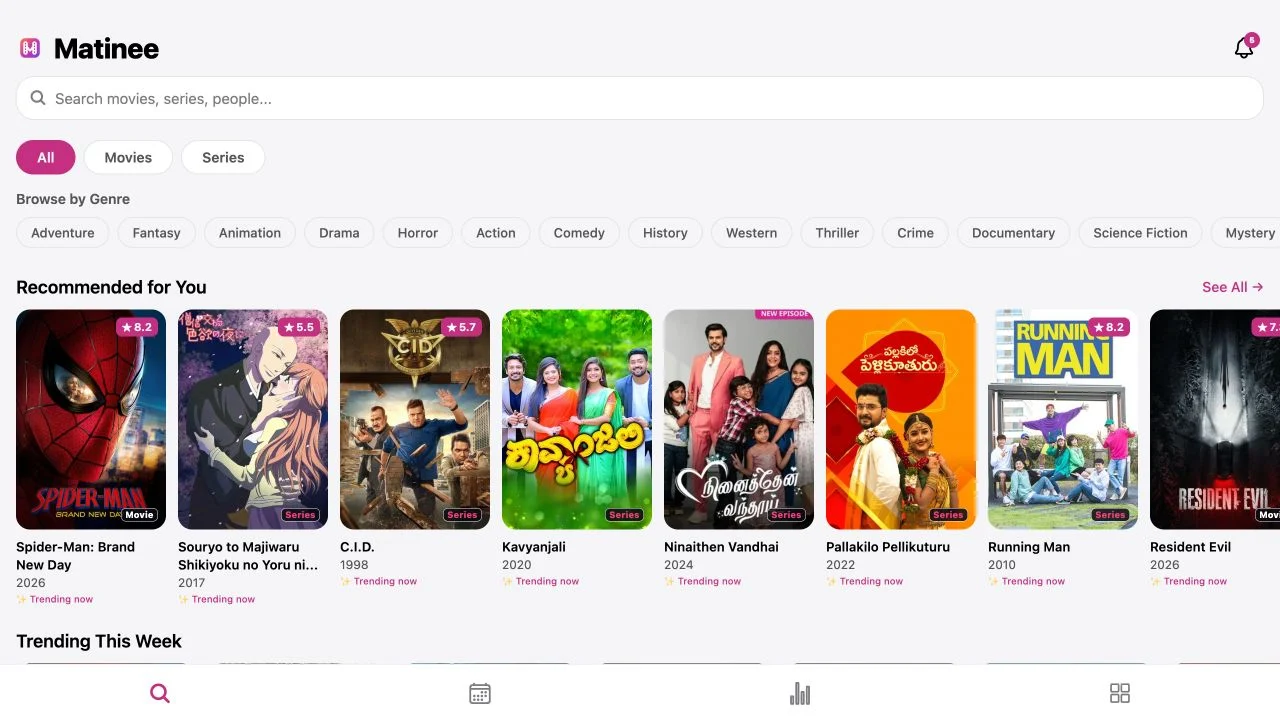
Original Matinee discovery screen. Posters and titles provide the starting point for browsing films and series.
View full size ↗01 The problem
How can personal history help without filling the feed with more of the same?
Finding a title and choosing what to watch are related but different tasks. Matinee connects browsing with a personal record of saved and watched titles, using that history to shape the next set of suggestions.
Designed for Viewer deciding what to watch next. Choose a relevant title without repeatedly seeing near-duplicates.
User context Design assumption
Balancing a personal watch history with a desire for something different.
- The friction
- A large catalogue creates more browsing without necessarily creating confidence.
- Design implication
- Connect history with language, variety, and title context.
Example situation · illustrative scenario. Imagine having plenty of saved titles and still spending the evening deciding. Discovery only becomes useful when it helps a person make a choice that fits.
02 The outcome
A viewing history that leads somewhere new.
I connected discovery, watchlists, history and ratings so previous choices can inform the next one. Film and series context, language preferences and variety all have a place in that flow. I have not established a measured recommendation-accuracy result.
More about the experience
- Discovery and tracking connect. The archived capture shows the browsing surface.
- Relevance is an evaluation question. Local scoring makes the approach concrete without establishing accuracy.
03 The direction
History without repetition
Preference and variety need to work together. Ratings can guide the next suggestions, while repetition and language choices deserve their own controls.
Product artifact · history-to-discovery loop
My direction. I connected watching, rating, and discovery into a loop, with a layout that adapts to how much room the person has.
Process and product scope
I connected browsing with the personal record of saved, rated, and watched titles. The design question is how that history can make the next discovery session more relevant without becoming repetitive.
Language preferences, variety, and recognisable film/series labels inform the browsing experience. Navigation and poster density should adapt to the screen while keeping the selected title and next action clear.
- 2
- media types: films and series
- Local
- recommendation scoring
- Adaptive
- phone and wider layouts
- Save
Keep the titles that interest you.
- Watch & rate
Give your history useful preference signals.
- Discover
Bring that context back into the next choice.
04 Design decisions
Help someone choose what to watch.
Open a decision to see the reasoning and trade-off.
01Keep a title’s type visible
Movie/series identifiers appear in discovery and combined lists.
Why this matters. A person choosing a two-hour film has a different commitment from someone starting a series.
The trade-off. A badge helps scanning but does not replace runtime and season information near a decision.
02Let personal history influence discovery
Ratings and watch patterns feed a local scoring process, with controls against repetitive franchises or genres.
Why this matters. Recommendations should reflect preference without becoming a list of near-duplicates.
The trade-off. A scoring rule is not evidence of relevance. Cold-start and unexpected recommendations need separate evaluation.
03Adapt the structure to the screen
Phone navigation becomes a side rail at wider sizes, and poster grids expand.
Why this matters. The same task can use space differently without turning a larger screen into a stretched phone layout.
The trade-off. Density should still preserve readable text, meaningful focus order, and a clear selected title.
05 Reflection
A recommendation earns its place by helping someone choose.
I would ask whether people found something they wanted to watch, not just something they clicked. I would also check whether suggestions become too familiar after a few ratings.
What I would evaluate next proposed work
- compare a new profile with a rated-history profile and ask participants why each suggestion feels relevant or repetitive.
- useful selections, unwanted repetition, and confidence choosing across preferred languages.
Turn a time and place into a sky to keep.