GetMetaDataDesign study · 5 min read
An SEO panel you can actually scan.
A browser-extension redesign exploring information hierarchy for people with different levels of SEO experience.
Read the case study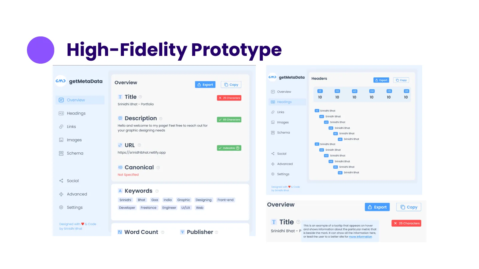
The final prototype provides the visual outcome; task-based validation remains the next step.
View full size ↗01 The problem
What should stay visible when an inspector becomes easier to read?
GetMetaData exposes a page’s SEO elements, but a dense readout makes it difficult to see what needs attention. The original review describes small text, weak information architecture, and a repeated-output bug. My task was to improve inspection without stripping away the useful detail or export capability.
Designed for SEO specialist & small-business content owner. Find and understand relevant page information.
User context Original persona framing · not interview-validated
Two personas in the original deck frame expert inspection and a less technical reading need.
- The friction
- Dense lists make scanning difficult; unfamiliar terms make the same display harder for a novice.
- Design implication
- Preserve depth while creating clearer groups and entry points.
Example situation · illustrative scenario. Imagine opening an SEO extension to answer one question about a page. The tool has plenty of data, but finding the relevant item becomes another inspection task.
02 Research & direction
Two ways of reading
The historical review found useful depth and export alongside small text, weak organisation, and duplicated output. A visual refresh needed to preserve the valuable workflow.
Historical review · three competitors
- 3
- competitors reviewed
- 1
- shared comparison site
- 2
- persona perspectives
My direction. I separated three concerns: finding information, interpreting it, and making sure the extraction itself is correct.
More about the original process
I compared SEO META in 1 CLICK, All in One SEO Analyzer, and Detailed SEO Extension alongside GetMetaData. I used my own portfolio as the common test page and looked at functionality, usability, SEO information, and documentation. This kept the content context consistent, although one website could not represent every page structure.
I then used two persona perspectives—an SEO engineer and a small-business/content-marketing user—to frame different reading needs, before creating wireframes and a high-fidelity prototype. The deck does not document interviews validating those personas, so I use them as design lenses rather than research findings.
- Locate
Get to the relevant category.
- Inspect
Read the page evidence in context.
- Carry forward
Keep export useful in the wider workflow.
03 Design decisions
Help different users scan the same metadata.
Open a decision to see the reasoning and trade-off.
01Retain information depth, improve the route through it
The redesign explores a clearer hierarchy for metadata, headings, images, structured data, and links.
Why this matters. An inspector should help a person locate relevant evidence before asking them to interpret a full page of metrics.
The trade-off. A more segmented interface can make cross-category comparison harder. Testing should include jumping between related issues.
02Compare tools in a controlled content context
I reviewed the competing extensions against the same portfolio page.
Why this matters. Using one common page makes differences in presentation easier to discuss without changing the underlying website at every comparison.
The trade-off. The review is a historical snapshot on one site, not a current market ranking or a large performance benchmark.
03Separate interface redesign from a functional repair
The review records duplicated output as a bug, while the deliverable remains an interface prototype.
Why this matters. Making data easier to read would not fix incorrect or repeated extraction. The two problems need separate acceptance criteria.
The trade-off. The prototype can demonstrate hierarchy and navigation; it cannot prove the extraction bug was resolved.
04 The outcome
A more structured inspection surface.
I completed the competitor review, wireframes and high-fidelity prototype. The redesign groups the extension’s information into clearer destinations while retaining its depth and export workflow. I recorded the repeated-output bug separately; an interface prototype could not establish whether extraction had been fixed.
More about the experience
- Grouped information. The high-fidelity prototype explores a clearer inspection hierarchy.
- A usable work surface. Readability and navigation are part of the tool’s utility.
- A separate acceptance criterion. The repeated-output bug needs an product behaviour fix beyond this prototype.
05 Reflection
Information depth becomes useful when there is a clear route through it.
The next test should use real inspection tasks: find a missing description, check headings, compare related issues and export the findings. That would tell me more than asking whether the new panel looks cleaner.
What I would evaluate next proposed work
- ask a novice and an experienced practitioner to locate a missing title, inspect image descriptions, and export their findings.
- correct extraction without duplication, clear reading order, and useful handling of a page with unusually long or missing values.
Let the work lead the portfolio.